 |
1. What is a call to action (CTA) in email marketing?
2. Why is a CTA important for a sales email?
3. Best Practices for Writing email CTA
4. Tips to use CTA effectively in your email marketing
5.How to craft the perfect CTA in an email marketing campaign?
Every email has an objective. A key goal for email campaigns should be to inform subscribers of a product update, an upcoming event, or the most recent discounts. Typically, the goal is to urge subscribers to take some sort of action. You’ve managed to keep their interest and persuade them to open, then it’s time to focus everything on clicking. Fortunately, there is a wealth of knowledge in the field, best practices, and business expertise to help build effective CTAs that generate revenue. Every button and link in email marketing campaigns is a call-to-action prompt. Even if we aren’t constantly aware of it, we come across hundreds of calls to action every day. However, considering the volume of CTAs we see every day, it takes a highly compelling one to grab our attention and stay in our memories. In rare instances, a company’s internal marketing team may develop its own CTAs. Some small businesses are also drawn to the attention of marketing or virtual assistant services.
What is call to action(CTA) in email marketing ?
A call to action is a phrase that persuades subscribers to carry out a certain action, such as making a purchase or signing up for a service. It must be brief and understandable enough to influence your reader’s decision. These sentences show up as distinct buttons or hypertext links in emails. When readers click on them, they are directed to a website where they can take the action you want them to.
A marketing copy call to action encourages your readers to take action. It’s the portion of your email marketing campaigns that directs users to your website, to put it simply. So, in order to create leads, your call to action (CTA) should be compelling and memorable so that visitors would desire to convert to customers. The problem with calls to action is that you typically only have a little amount of room to express yourself. Most of the time, it’s simply a popup or button, so you need to be clever with your language to say w2hat has to be said succinctly while yet making it sound amusing.
Why is a CTA important for a sales email?
Each email you send has a specific goal, such as increasing email open rate, obtaining user feedback, directing recipients to your landing page, etc. A strong call to action becomes crucial because:
Provides users with the right direction:
A crystal clear, captivating and strategically positioned email CTA directs users to a specific path and encourages action.
Increases click-through and conversion rates:
A strong CTA grabs users attention and helps establish trust and provide distinctive value propositions. It thus generates more clicks and conversions.
You have created the ideal subject line for your marketing email, attracted the interest of your audience, and convinced them to open your email.
Next, what? They must now put their emphasis into practice.
How? Utilizing conversion-focused Call to Action (CTA) buttons.
What are CTA buttons and why are they significant? CTAs are clickable buttons that, based on the objective of your content, urge your audience to perform a particular action. They are your most important tool for converting visitors into leads as they prolong the user journey by linking back to your website.
- Emails with a single call-to-action increased clicks by 371% and sales by 1617%. (WordStream)
- According to Creative MMS:
— CTAs on the landing page increase conversions by 80%.
— Revenue increases by 83% when relevant and well-placed.
— Site and product sign-up increases by 34%.
- For a customer, Brafton produced design adjustments that prioritized pertinent, strategically positioned CTAs.
— In a single month, adding CTA buttons to article templates raised revenue by 83%.
— The conversion rate for online sales went up 22% from one quarter to the next.
— The average order value for blog readers rose 49% from one quarter to the next.
- Social Times’ email clickthrough rate (CTR) increased by 158% when social media sharing buttons were included.
Best Practices for Writing email CTA
Here are some email CTA best practices to ensure your emails convert:
1.Lead With Purpose
The CTA button needs to have a clear purpose that explains to your recipients not only WHAT to do, but WHY, just like your email does. Lack of clarity might result in poor conversion because the reader will probably not click the button if they are unsure of where it will take them.
For instance, Pepper.IO that tells the reader to “CLICK HERE” offers minimal value and offers no explanation of where or why the reader is going. Instead, make sure your CTA button encourages the reader to take action in response to the email content they have just read by using active words and phrases.
2.Short Is Sweet
A CTA button in mobile email campaign should have between two and four words on it. Much shorter and it would sound too sudden. If the copy is any longer, it can be lost amid the other body copy.
- Action Words Vs Friction Words
Friction words imply that people must take action. They are more straightforward, but they may also be coercive and give the impression that the reader is giving up something – whether it is time, money, or effort. Action words highlight what individuals may desire to do. Action words are frequently more successful for CTA buttons because readers want the feeling of having a choice. While you shouldn’t discount friction remarks because of this, exercise caution.
Example Of Action Words
- Find out more
- Get Started
- Discover
- Explore
Example Of Friction Words
- Buy
- Download
- Submit
- Get
3.How Many is Too Many
You could be tempted to scatter CTA buttons like confetti if your goal is to persuade your audience to “CLICK.” This isn’t always the greatest approach, though. The reader experience can be ruined by too many CTAs, which also lowers conversion rates.
So how many CTA buttons should you include in your email? Although there isn’t a magic number, it is widely accepted that if you’re adding more than three, you should make sure you have a really solid explanation for each of them.
Before making a choice, consider the following factors:
- Length of the email
It makes sense to include just one CTA in emails that are succinct and to the point. This keeps the reader’s attention to the specific action you want them to take and it’s unlikely to get lost below the fold. With lengthy emails, it makes sense to lead with a CTA button, then break the material up with another in case the reader doesn’t make it all the way to the end.
- Aim of the email
A single CTA may occasionally have the opposite result and be counterproductive. One “SIGN UP NOW” CTA can turn off some of your readers if the goal of your email is to entice them to sign up for early access to a promotion. They might want to “FIND OUT MORE” first instead of signing up right away.
- Location
Although WHAT you write on your CTA buttons needs to be carefully considered, WHERE you put them is equally crucial.
- Lead with CTA
You can’t expect your readers to look up what they should do next in a world where attention spans only last a few seconds. The inclusion of a CTA button on the banner will aid in generating an immediate reaction because your intro banner language often serves as a summary of the email offer.
Individual Product Blocks
The reader may find it helpful if each of the individual product blocks you’ve included in the body of your email copy has its own CTA button.
- Finish with CTA
Always include a CTA button at the end of the email. As a result, when the reader reaches the email’s conclusion, there is no question as to what to do.
4.Click to Convert
You’ll notice a difference in your click-through and conversion rates if you spend a little more time on your CTA buttons. Nevertheless, converting CTA buttons is only one element of your email strategy and marketing plan
Tips to use CTA effectively in your email marketing
The CTA, or call to action, is an essential component of email marketing since it tells your readers what to do. Here are some pointers for strategically using CTA in your email marketing
- Keep it concise and precise: Make sure the action you want the reader to perform is mentioned clearly in your CTA and that it is clear and specific. Make use of active verbs to inspire readers to take action.
- Make it obvious: Have your CTA prominently displayed in the email, perhaps near the conclusion of the message or somewhere noticeable in the body.
- Utilize time-limited incentives or restricted availability to instill a sense of urgency in your readers and motivate them to act right now
- Be inventive. Make the reader want to click through and take action by using imaginative writing or pictures that grab their attention.
- Employ A/B testing: Compare the performance of several iterations of your CTA, then employ the most effective one in subsequent email campaigns.
- Maintain relevance: Make sure your CTA gives value to the reader and is pertinent to the email’s content. A CTA that is unclear and unattractive can conflict with the email’s content.
By following these tips, you can make your CTA more effective in driving the desired action from your email subscribers.
How to craft the perfect CTA in an email marketing campaign?
You must establish the goal of your CTA before you start writing it. Ask these three questions to yourself:
- What specific action do you want your followers to take?
- What are the best ways to convey it to your subscribers?
- What benefits would it provide for subscribers?
The purpose and justification for subscribers clicking on that CTA button must be very apparent. Aiming to provide value to your subscribers in exchange for their time and attention should be the goal of every CTA. Therefore, take some time to respond to these questions. Then you can consider developing a CTA. There are three things to take into account while creating a call-to-action to make it stand out:
- Placements of call-to-action
- Design of call-to-action
- Encourage action
- Call-to-action copy
We will discuss guidelines and best practices for each of these three aspects in the following
Designing call to action
The following are various strategies to make your email CTA design stand out:
- Employ a roll-over or hover effect
A hover effect is a visual effect that draws attention to and can make it clear to subscribers what is clickable.
For instance, the hover effect causes the color or style of the element to change as visitors move their cursor over a link button or text.
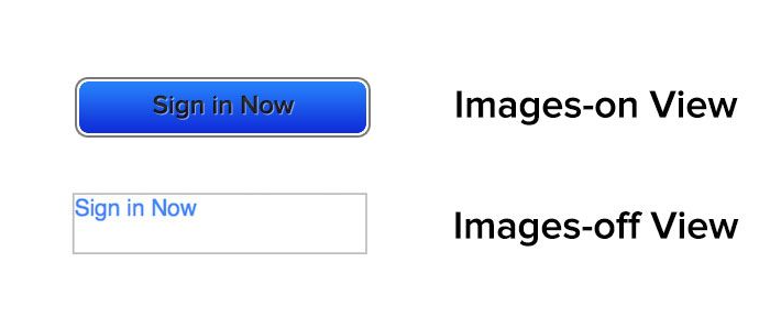
- Use CTA buttons that can withstand gunfire
CTA buttons that are impenetrable are created using code rather than a picture. The buttons are “bulletproof” because they simply use code and display in all email clients even when graphics are disabled.
 |
- Utilize a strong color contrast
The color palette of your CTA button should match that of the entire email. A poor user experience might result from email CTAs that are difficult to read due to poor or low color contrast. Consequently, to improve the user’s experience, employ highly contrasting colors. Additionally, utilizing sufficient color contrast makes your email CTA visible to all users. According to WCAG recommendations, you should maintain a color contrast ratio of at least 4:5:1.
Writing call-to-action
You should adhere to the following in your CTA copy:
- Fulfill the commitments made in your email text.
- Provide something of value in return for the user’s time and attention.
- Make clear what users should do.
So let’s talk about how you can accomplish this:
- Direct communication with your audience
Instead of giving them a command, speak to your subscribers to build a relationship with them and encourage them to click the CTA button. According to a recent Unbounce study, utilizing the first person pronoun while speaking to your subscribers increases clickthrough rates by 90%.
- Make use of active verbs
Learn more, click here, and similar expressions don’t identify an action and hinder conversion. Use verbs that can be taken as actions to let people know what to expect when they click the CTA button. Here are some more effective email call-to-action examples with actionable verbs:
- Buy now and get 15% off and free shipping.
- Check out our spring collection.
- Take this 5 minute survey.
- Share your feedback.
Create Urgency to encourage action
Due to the fear of missing out, people respond quickly to deadlines. In order to persuade people to act right away, add a sense of urgency to your CTA language. You can use a countdown timer to alert users to the impending deadline and encourage them to take action right now.
Placement of call-to-action
Only if the CTA is obvious and situated in the most visible area of your email will the CTA design and copy produce results. Therefore, where do you put it? There is no correct or incorrect response because it relies on your email’s layout, copy length, and CTA density. However, the following advice will assist you in where to insert the email CTA:
- Put your calls to action next to pertinent material if your email contains many calls to action, as in a newsletter.
- To make your email immediately visible to readers, place the CTA at the beginning of the message.
- Making it appear uncluttered and simple to find is another consideration for CTA placement. This is possible given enough empty space. To help readers find and recognise the CTA, leave enough white space surrounding it. The right amount of white space will highlight the CTA and give the reader a clutter-free experience.
Conclusion
How you craft your email call-to-action directly affects how effective your campaign will be? To write a good email CTA, use language that’s relevant to your brand and the action you want your reader to take. Use actionable words and be direct. Don’t leave your reader questioning what to do next. Command them. But do so in a non-standoffish way. Once you’ve mastered how to write call-to-action phrases that spur your readers to action, your email campaigns will drive much more revenue and pave the way for sustainable growth.
Latest Blogs

Apptivo's Integration with Amazon SES for Outgoing Email Server
Amazon Simple Email Service (SES) is an email platform that provides an easy, cost-effective way to send and receive email using your email addresses and domains. Apptivo has migrated its email service to Amazon SES (Simple Email Service) to enhance the performance and reliability of our email services
Read more →
EXPLORING MULTI CHANNEL CUSTOMER SUPPORT SOFTWARE
1.What is customer service software? 2
Read more →
Maximize your business performance with seamless CRM Integration
1.What is CRM Integration? 2
Read more →
