It’s OK to learn from experts when we’re trying to improve. They must be doing something right, that’s worth mimicking. Or else, how would they be doing so well right?
Landing pages exist to convert visitors into customers and there is no one right method to design a landing page. It takes time, a whole lot of feedback, and stats to get your right fit. To ease up this process, we compiled the best landing pages that you can get inspired form and work on top of that.
Uber
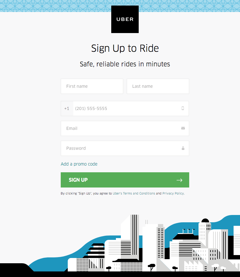
What’s Done Well
- The optional promo code field keeps the form limited to 5 fields.
- The green CTA button stands out and there is no other green on the page.
- The perfectly sized Uber logo at the top lets the user know where they are in an instant.
Apptivo
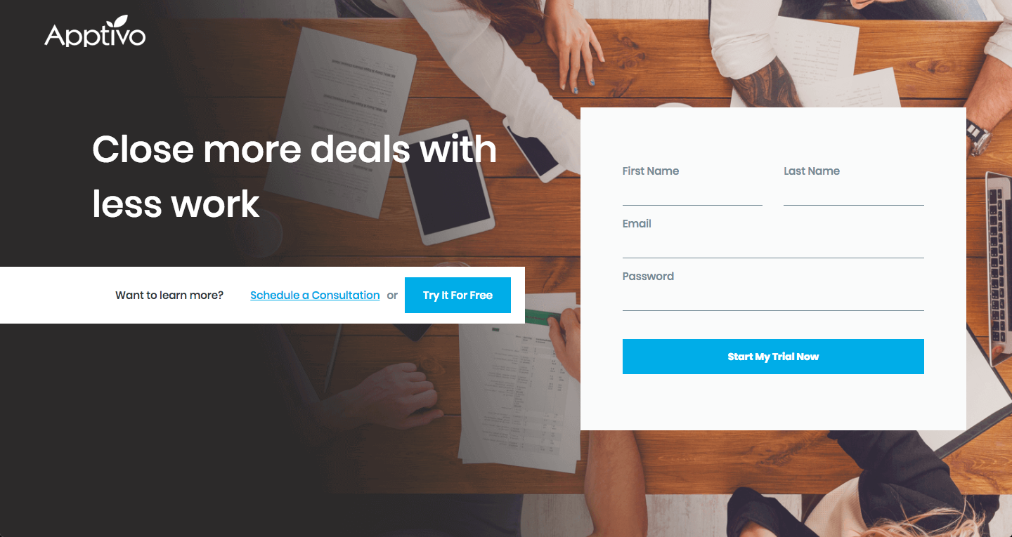
What’s Done Well
- The title is promising and ensures positivity.
- Try It For Free button shows the visitors that it’s free
- 4-field form is easy and quick to fill out
- Schedule a Consultation button helps visitors to get a demo in a click
Squarespace
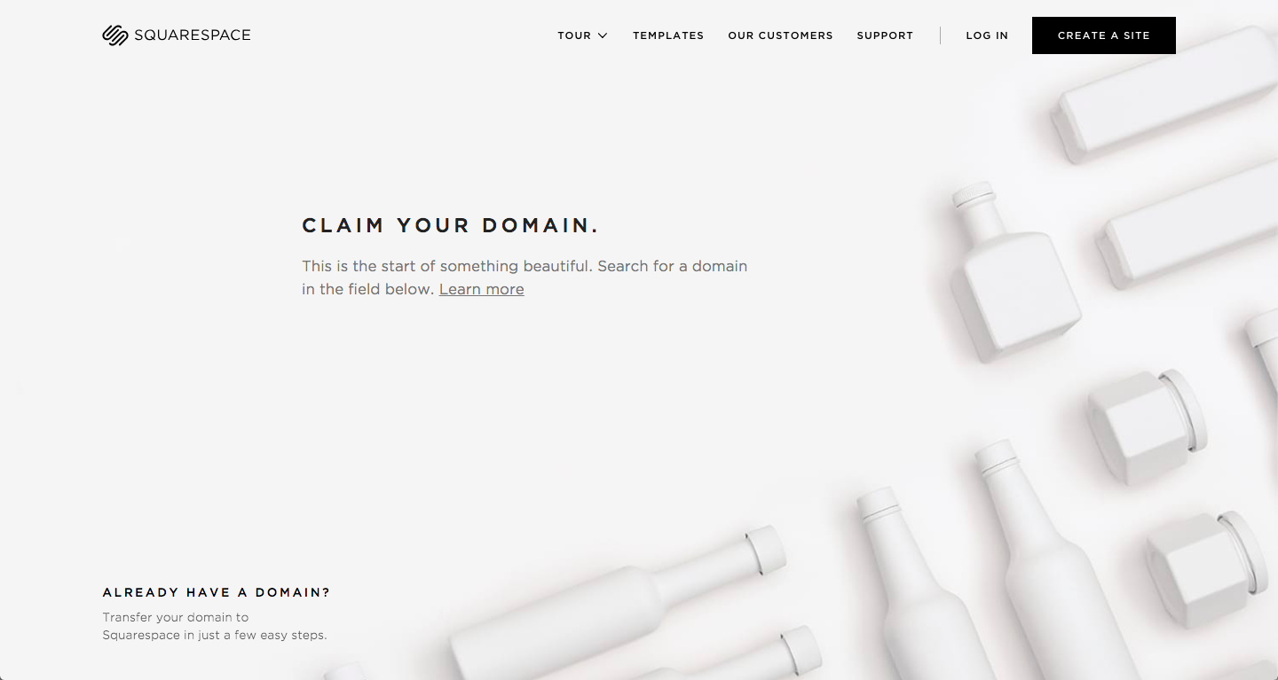
What’s Done Well
- Minimal texts. Easy to read.
- The title. It’s to the point and imposes a sense of urgency.
- The simple, uniform font gives a professional scent.
GetResponse
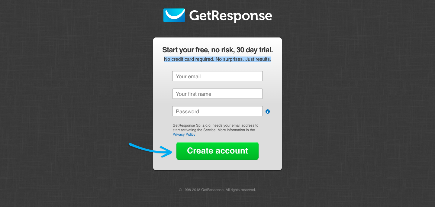
What’s Done Well
- The arrow pointed directly at the CTA button attracts visitors attention directly to creating an account.
- The three field form which doesn’t require a last name is simple and neat.
- The headline and subheadline tell visitors exactly what the page is for and clearly states that it’s free.
Optimizely
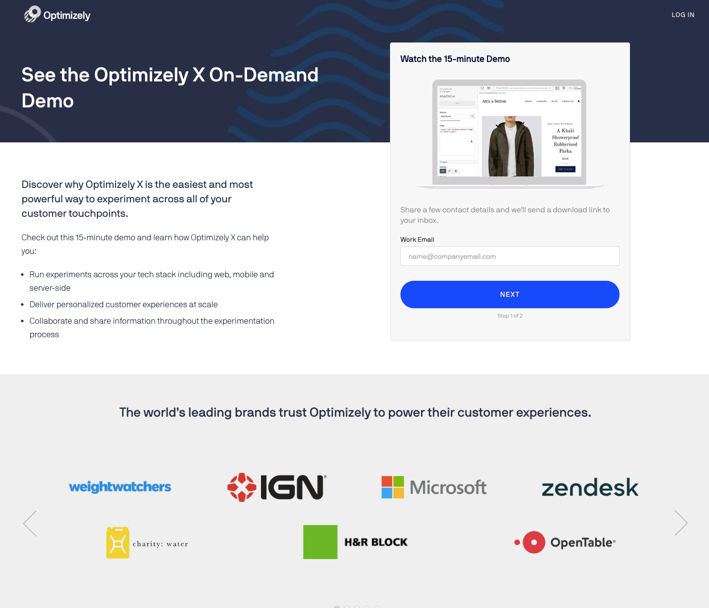
What’s Done Well
- The 1-field form is quick and slick.
- Sending the demo video download link is a job well done.
- The testimonials do an excellent job of selling the concept to the reader.
Cheers,
Prithvi
